
Context
Academic Project from 2023.09 to 2023.10
Role: Graphic Designer, UI Designer, Interaction Designer
Tools: Figma
Team Members: Muhan Huang, Terence Xu, Harvey Li, Jeryl Villasoto, Sal Agnihotri, Jihoon Lee
Dutch Design Week
Role: Graphic Designer, UI Designer, Interaction Designer
Overview
The The purpose of this project was to create a new visual identity for Dutch Design Week. Content included poster design, asset design and website design.
Research + Our Goal

Dutch Design Week
DDW prioritizes experimentation, innovation, and the convergence of ideas in the design domain. It focuses on both envisioning the design landscape of future and how design itself evolves. The primary goal is to illustrate how designers from diverse backgrounds contribute to a brighter future while enhancing the significance of Dutch designers.
DDW Music Festival
The DDW Music Festival is a nighttime event organized by DDW, which also carries on the DDW tradition of bringing something new and fresh to Eindhoven in terms of music, which advocates creativity and experimentation, never limiting itself to a single genre and catering to an audience that enjoys any type of music.

Our Goal
The festival was selected not only due to its affiliation with DDW but also because it had received limited promotion. This outstanding event merits greater recognition. Therefore, our goal is not only to draw attention to the music festival but also to highlight musicians as designers in a world centred around sound.
Our objective is to swiftly convey the essence of the artist and event, enabling visitors to immerse themselves in the event's ambiance. We achieve this through videos, image montages, interaction design, and music clips.
Design Principle + Vignelli
The designer assigned to us is Massimo Vignelli. To gain insight from Vignelli's perspective, I read The Vignelli Canon and discovered that design requires "Intellectual Elegance," which reflects the designer's responsibility and mindset. Rather than following trends, designers should strive for timeless beauty. This is the approach I aimed to apply in this project.
Our group not only gathered Vignelli's work, but also familiarized ourselves with the other designers in Studio Boggeri and their designs, as well as contemporary works that share similar design elements. From these sources, we selected the designs that inspired us the most to analyze as precedents.
Below, we have compiled the design elements that were used in our project.
Textured Halftone Lines to Simplify Image and Create Depth
Using halftone lines to create texture and get rid of the unimportant details to highlight the main element. It also helps to create more depth when overlaying colors are applied.

Overlaying Colors to Create Focal Points
By using color overlays on top of our halftone image, it results in greater detail and color range. Our poster uses the subtractive properties of CMYK colors to create clear focal points.


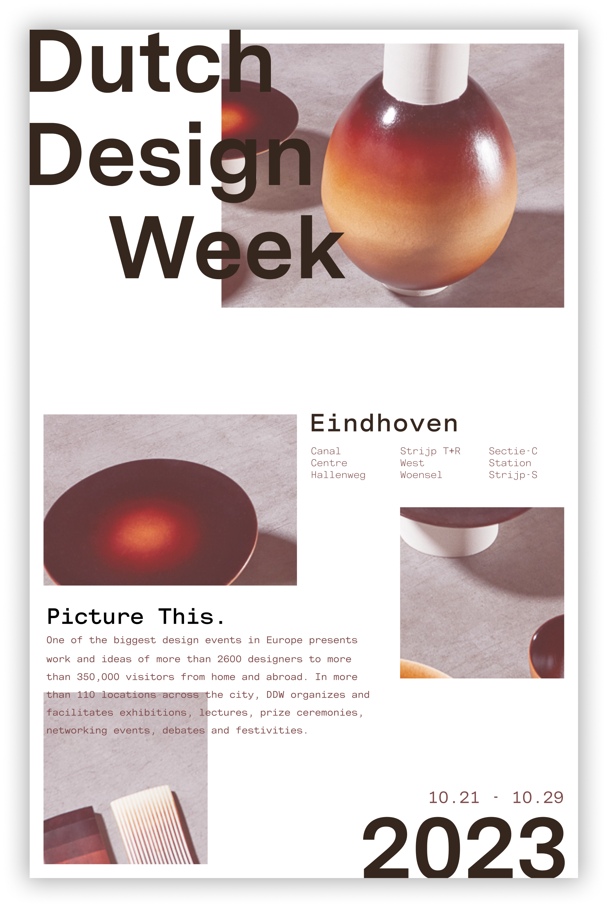
Poster Design
Poster design is the creative phase of the process, where I experiment with various colors, typographies, and images. However, I consistently used sans-serif fonts to achieve a neat and modern aesthetic.
Experiments on different image processing methods
To prevent the images from appearing too plain and uninteresting, I conducted experiments using various image processing techniques to add texture.


Poster Iterations
Halftone Lines Texture
Use halftone effects to play with retro media styles, like the early days of colour printing with high-resolution images that look like CMYK prints.

Colour Overlay
Use to draw attention to a specific area of the poster, such as an event date. This helps guide the viewer's eye and directs their attention to important details.
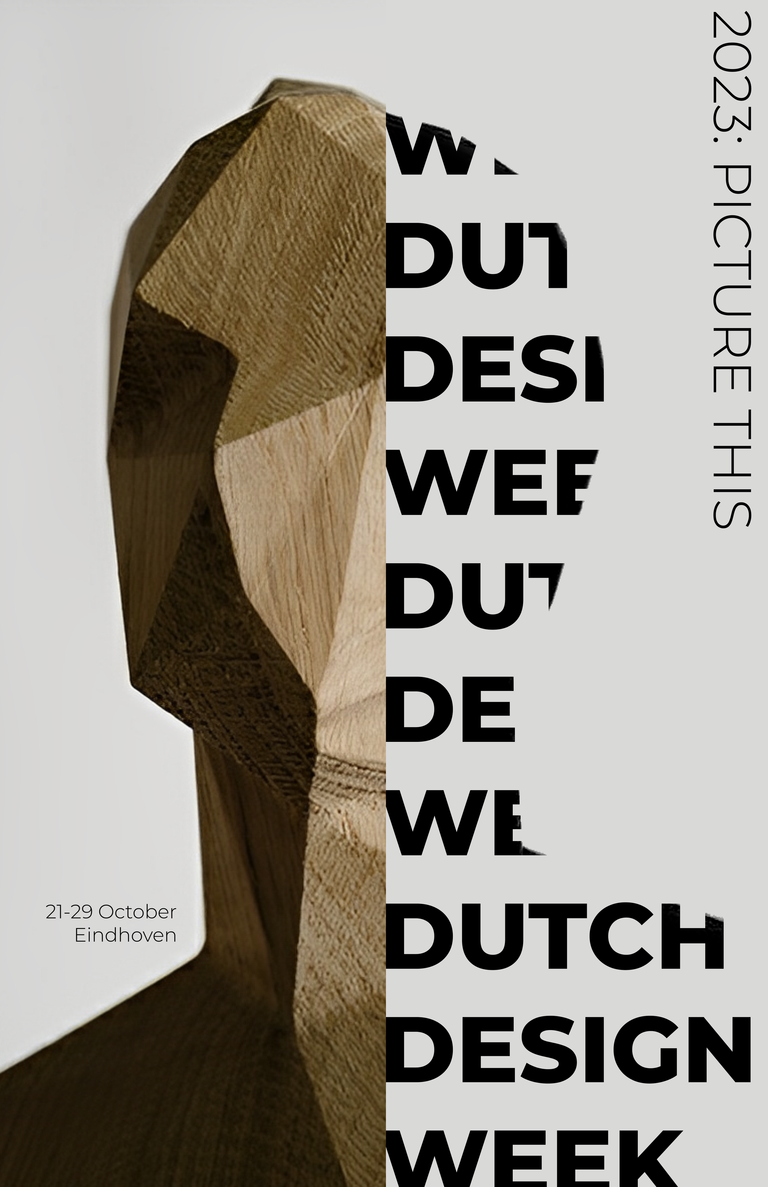
Textured Typography + Framing
Create a frame using image but use textured typography to break the frame, make the poster more tense and dynamic while maintaining readability.
Breaking Frame with Type
Using grids to create frames for type to brake into images.


A neutral brown palette with hints of orange and yellow matches the image, giving the poster a warm autumn feeling. We want to convey an idea that the turning of fall brings along the Dutch Design Week.
Maintain Hierarchy By Adjusting Opacity
Adjusting opacity to avoid date and title competing for hierarchy.

Orange and Blue are complementary colors with directly contrasting hue and temperature. with an additional an off-black backdrop, their contrast vibrancy is further enhanced.
Half-toned Effect
Vertically linear halftone texture make the poster more engaging and creates an axis along the poster that aligns with the image bars.
Muted red and dark green was used to reflect the experimental nature of Dutch Design and to give our direction a natural and organic feel. More so, with red and green being complementary colors, along with an off-black backdrop gives the design a visually striking contrast.


Layer Blur
Use layer blur to create the illusion of depth in two-dimensional designs. The main typography is legible from distance, but blends into the background up close.
Halftone Lines Texture
Edit the image to make it abstract and add halftone linear texture to make the poster more engaing.
Grid
To avoid texture clutter, use grids, especially in the vertical direction to keep information organized and easy to navigate.
Overlaying Image and Type
Using a brown screen overlay on the image to make the typeface legible when being overlapped. It’s also been treated to create a warm image to match with the color palette.
Content Grid
Using grids to organize infromation in a linear fashion. They are evenly spaced out to group text while still being in the same cluster.

The Messina typeface family is a font that provides visual clarity and functionality. The mono space type with it’s even spacing allows for each letter to be easily distinguished when overlaid on top images.
Grid And Balance
Carefully follow grid to balance the whole poster. Since the title is exaggerated enough, we keep the rest parts simple and clear to avoid confusion and over-complexity.
Bifur is chosen for it’s bold, geometric shapes that communicates freedom of expression; a theme that we want to communicate in association with the Dutch Design Week.

Textured Typography
Use Textured typography to create more energy.
Displaced Image Through Bars
The image being displaced into bars create ambiguity, pulling attention away from the image itself. The changing levels creates a dynamic layout for typography and image.

Alte Haas Grotesk brings a vintage printing effect; The rounded edges of each letter simulates the bleeding of ink on paper. This effect paired with the image treatment of halftones push the idea of early printing techniques.
Public Sans is used for copywriting because of it’s consistency in letterform. It’s also web friendly, which means it performs well in different resolutions.
Final Poster + Assets


Overlapping Halftones
We found this interesting effect of overlapping two colors to create a darker third color, so we used it to highlight and emphasize important parts of the image using this overlap on top of the halftone.
Grid by Content
We use 3 column grid system to organize information vertically, and also separate the frame to three parts where the important info may take two columns to be emphasized. It also helps to apply rule of third and create focal point.


Cyan and Magenta are used in CMYK print, which is a reference to image and printing techniques. When Cyan and Magenta are combined, they create a darker shade of blue, making it the second darkest color after black in terms of value. This enhances clarity by providing contrast against the thin halftone lines on the white background.


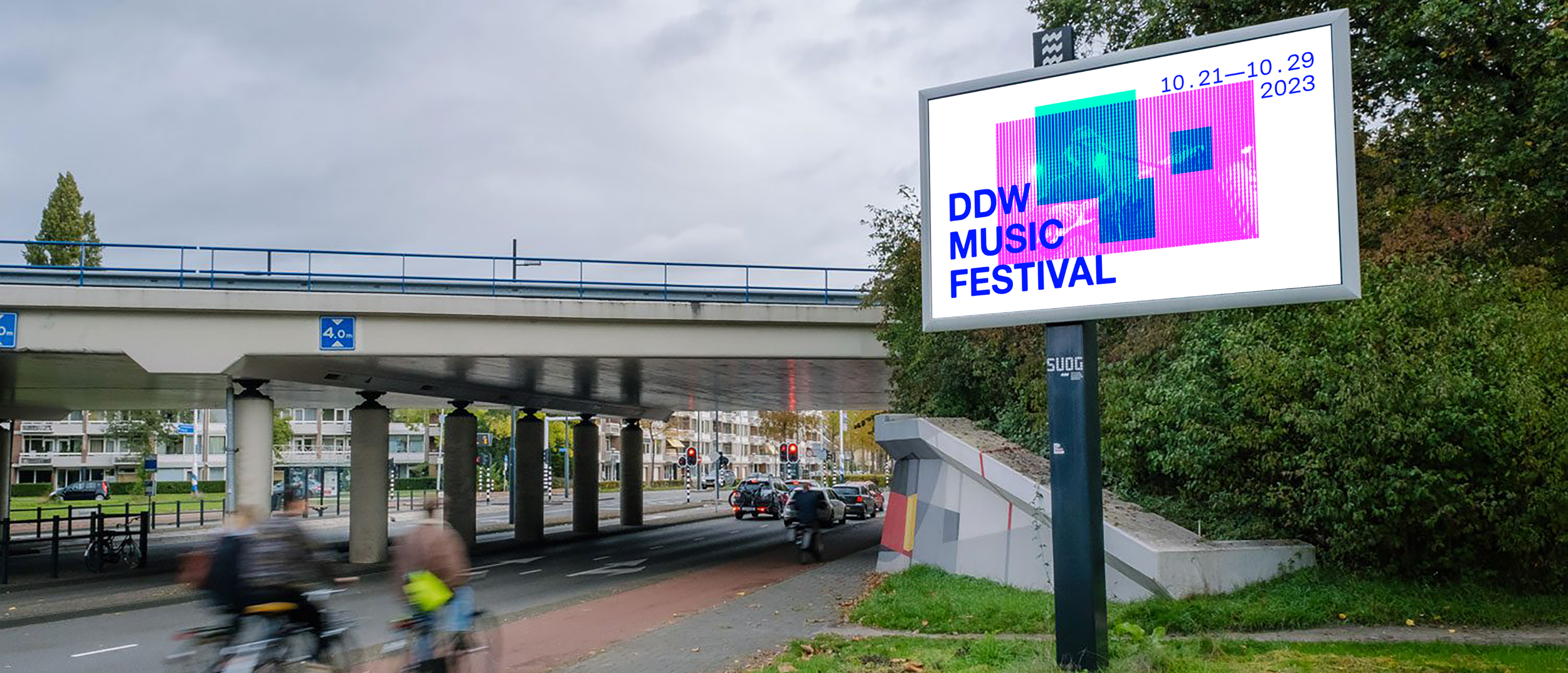
The reason for choosing this asset is that it is located next to a bicycle lane. Given the Dutch cycling culture in general, this poster will be highly visible to a large number of potential users.

Alte Haas Grotesk brings a vintage printing effect; The rounded edges of each letter simulates the bleeding of ink on paper. This effect paired with the image treatment of halftones push the idea of early printing techniques.
Messina Sans Mono is used to reinforce the theme of early printing techniques, as monospace fonts were employed in traditional printing.
The reason for choosing this asset is that it is located next to a bicycle lane. Given the Dutch cycling culture in general, this poster will be highly visible to a large number of potential users.
Microsite Design
After reviewing the precedents gathered by the group, my task was to design the layout of the microsite, including page transitions, animations, and interactions. I made sure to use the fonts and color palette from the posters to maintain consistency with the overall brand vision. Additionally, I incorporated slightly more abstract elements, such as event map, into the microsite to provide users with guided exploration.
The images on the precedent page automatically scroll to the left and they effectively show the visitor the overall style of the project. We were inspired by the idea of using the image collage to give visitors a general idea of the environmnt and vibe of each venue.
Precedents
Simple and clean typography is the best choice for making a database, so we used this as a basis for putting together the performance information for the music festival.
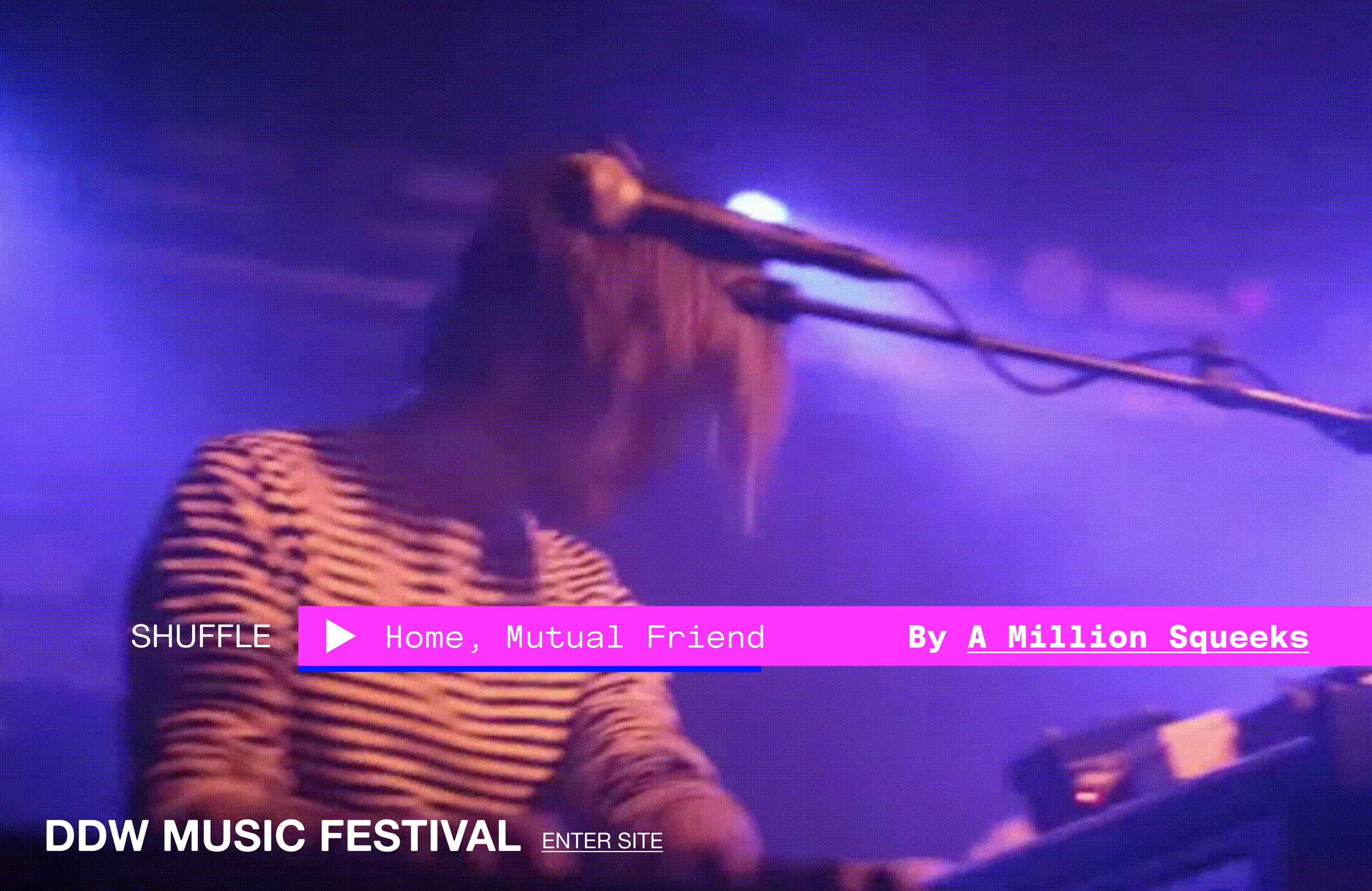
Video as Background
Our intention is to give users the overall vibe of the music festival for their first impression, so we are using the video as a backdrop to grab attention and give them a sense of engagement.
Slide-In Movement for The Shuffle Function
Our objective is to immerse visitors in the music itself and tailor their subsequent explorations to their musical preferences. To achieve this, we introduced the shuffle function as the initial point of interaction.
To capture users’ attention, we designed the shuffle as a dynamic element to smoothly slide into the frame from the edge.
Cursor
We are interested in overlapping colors, so we created an effect where overlapping the cursor with an element changes the color to enhance the interactive experience.
Photo Collage
In order to give visitors a quick overview of the vibe and environment of each location, we decided to use a photo collage format where the photos move from all directions to the center. If the visitors decide to explore the location further, the photos are gathered into a single inner page and scale up to reveal more information.
Inner Page
Our goal was to provide visitors with a seamless way to explore the venues on the map, allowing them to access additional information without the need to continuously navigate between different pages. As a solution, we decided to implement an inner page for displaying more comprehensive details.
Drag and Drop
There is a designated area where users can easily drag and drop a music clip to play. The drag and drop interaction is intended to simulate the record player, allowing the user to drag a vinyl record into a vinyl player.
Database and Sorting
To help visitors quickly find the information they need, they can alternatively use the database. The database automatically highlights activities at the selected location or allows visitors to sort it according to their preferences.
A scrollable inner page can be used to effectively display information that can't fit on the page without disrupting the overall interaction, so we decided to apply it to the schedule and as a transition stage to the next page.